Work People About Contact

The Triennale Museum Gets a Data-driven Makeover

2019 Triennale Design Museum | Art Design Museums

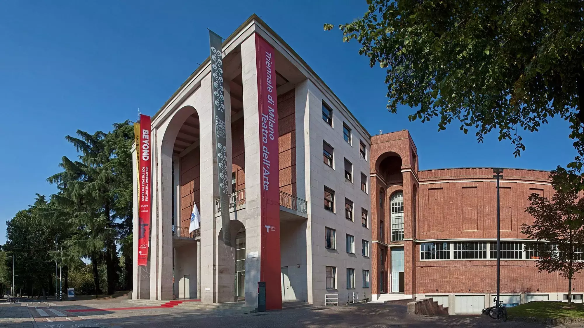
The Triennale Museum is a year–round showcase for the type of art, architecture, and design objects that have appeared since 1933 at the international expos of the same name. When the organization embarked on a rebrand in 2019, their board of directors—comprising some of the world's most influential figures in Design—chose Accurat to spearhead the online renovation.

Challenge

Centralize and streamline the Triennale Museum's digital ecosystem.

Solution

A completely reimagined data-driven hub for research, exploration, and planning.

Services

Product/service strategy; User research; UX, UI, and brand design; Front & back–end development; Impact monitoring

Deliverables

Website; Content archives

Background & Process

More than a place for people to access information about the museum, the hub would act as a centralized resource for visitors, researchers, and museum staff. The scope entailed several unique builds:

  • A comprehensive, explorable archive to house media related to triannual exhibitions and design objects;

  • An online publication to host news and commentary about design;

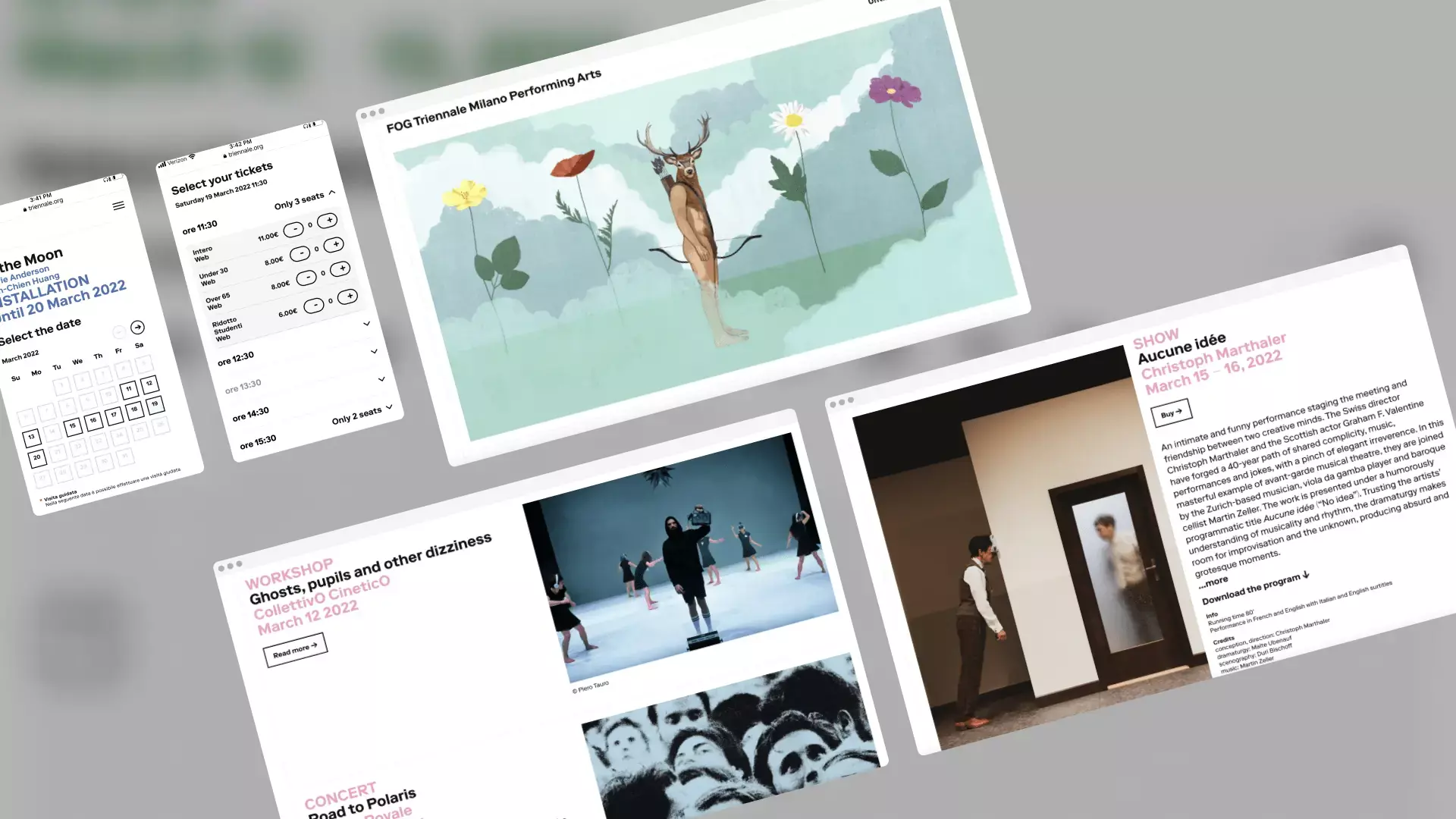
  • A ticketing platform for users to book tickets to the museum and/or regular events.

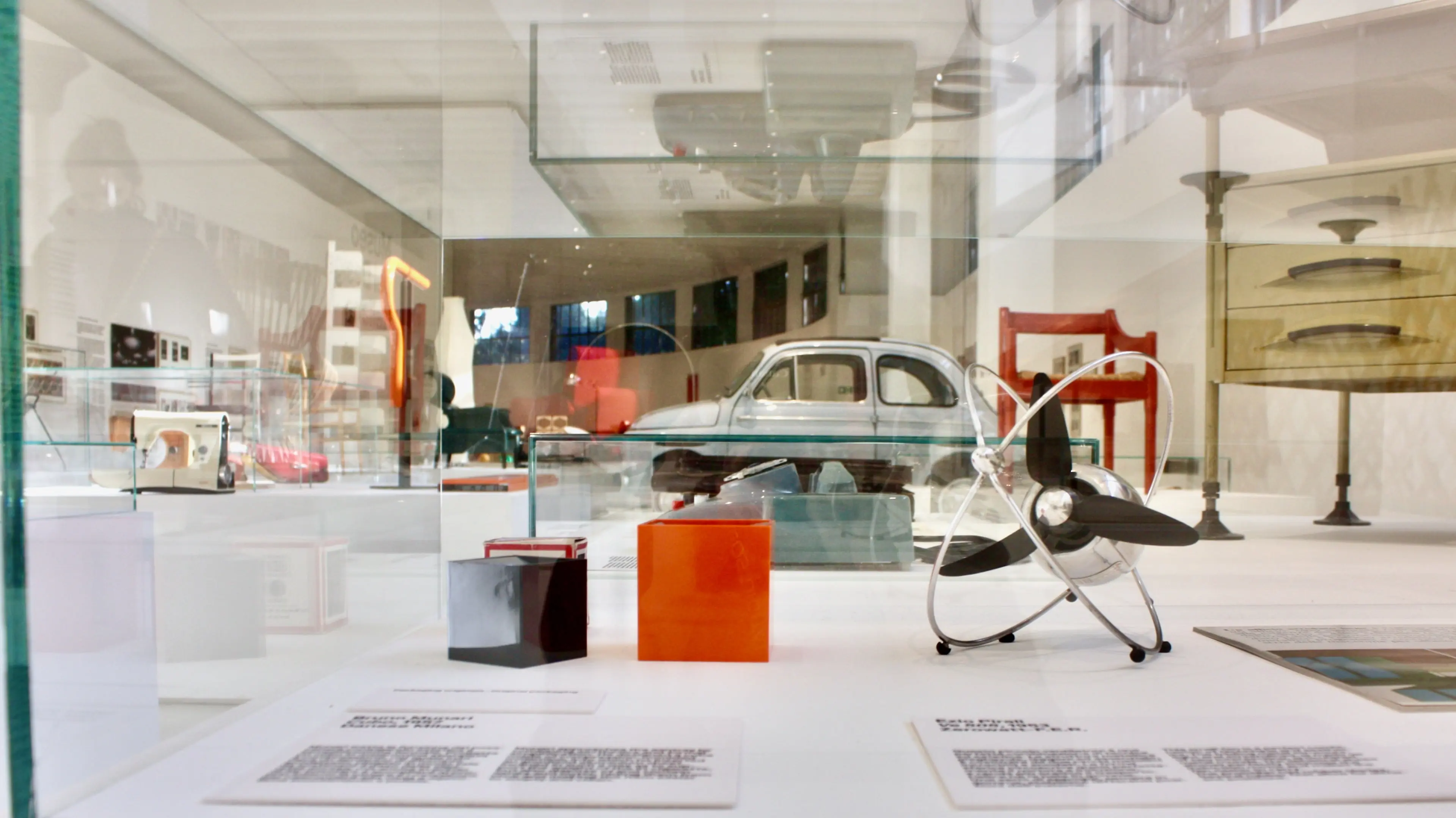
In designing a cohesive look for the online destination, we took inspiration from the space itself. The Triennale Museum is airy and capacious. The main hall housing the permanent collection is a bright white expanse, where objects are evenly spaced in freestanding glass cases. The layout serves to draw the eye to the unique colors, shapes, and textures of each item.

Outcome

We rebuilt the entire digital ecosystem of the museum, inclusive of the website, the online store, the ticketing platform, the archives, the magazine, and even digital signage at the actual museum. Every facet, irrespective of format (mobile, desktop, digital display) coheres to a new visual identity that we also reimagined, inspired by the museum's architecture and layout.

On the back–end, web administrators can manage content for all touchpoints, both internal (archives, display screens) and external (website, magazine). This provides a seamless experience for staff to update content, and/or to access media for the creation of articles, press materials, and more. For example: an employee who works in events could write an event description, source accompanying imagery from the archives, push it live, and manage ticket sales, all without ever leaving the platform.

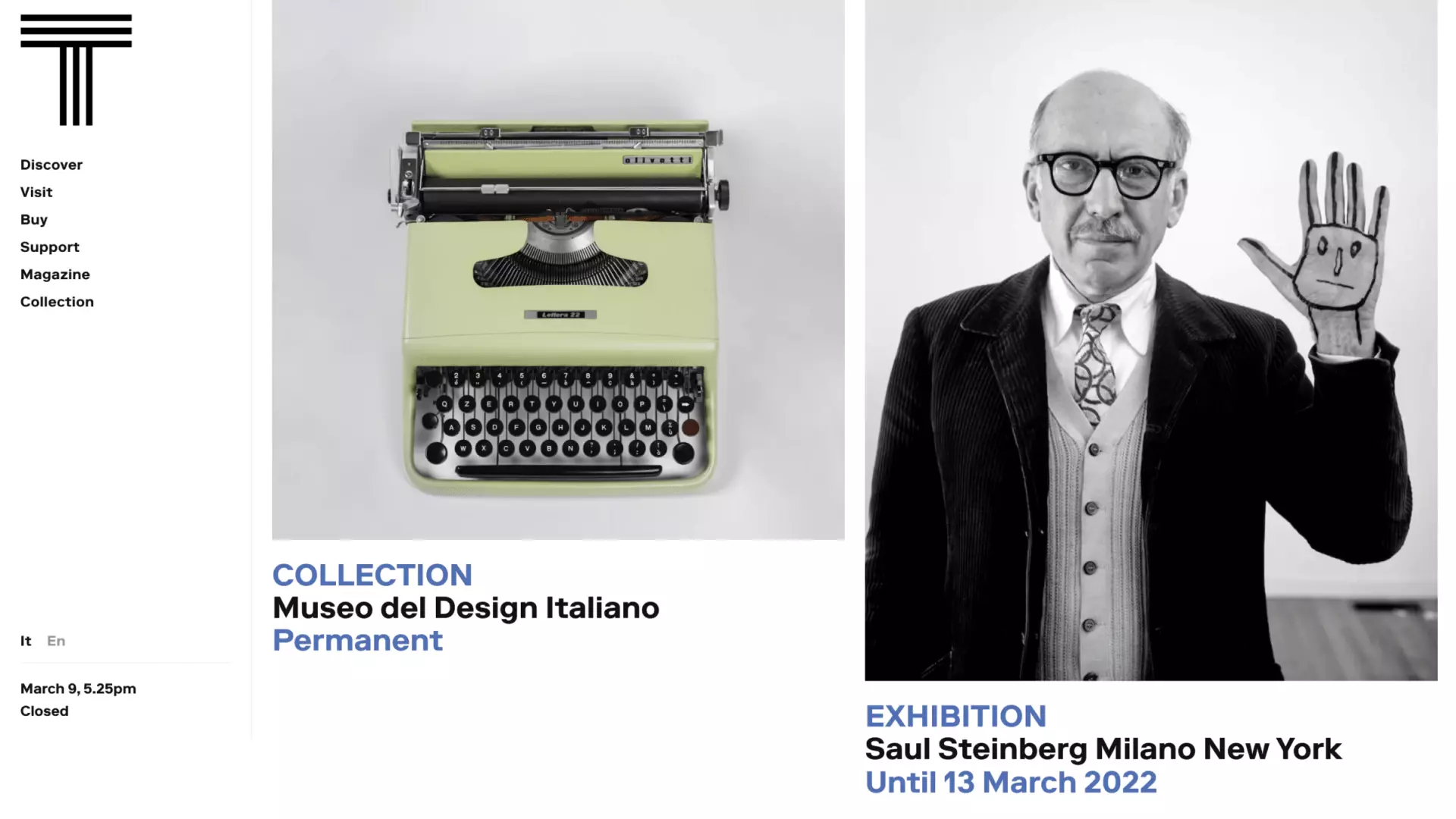
The website meets user needs at every layer of engagement. Practical information about the museum and its calendar of events exist alongside booking capabilities to help would–be visitors plan their trip from end–to–end. The website is its own destination for design enthusiasts without plans to visit. The brand's Magazine hosts articles, features, and a regular podcast related to current programming and the design world at large.
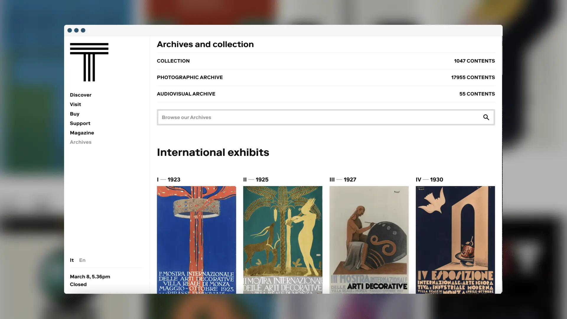
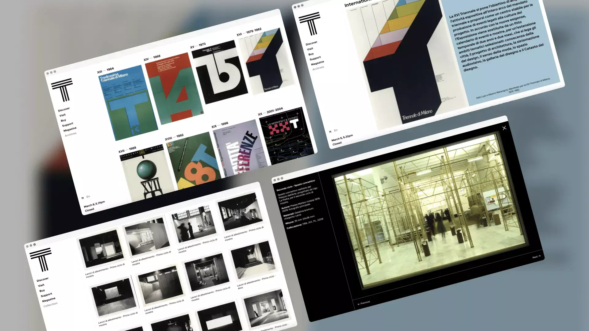
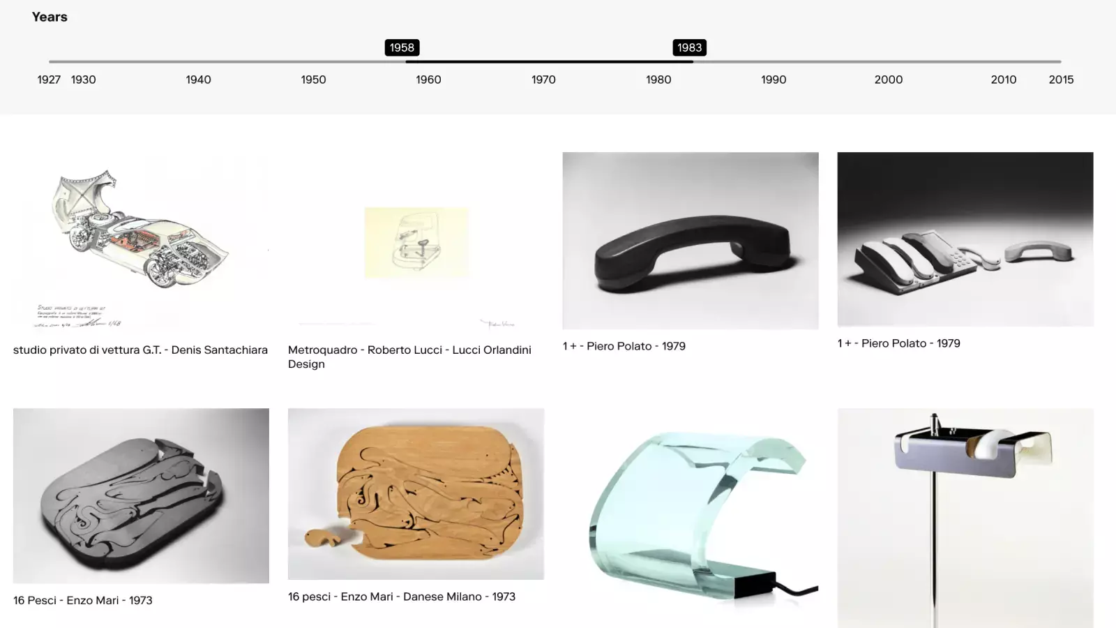
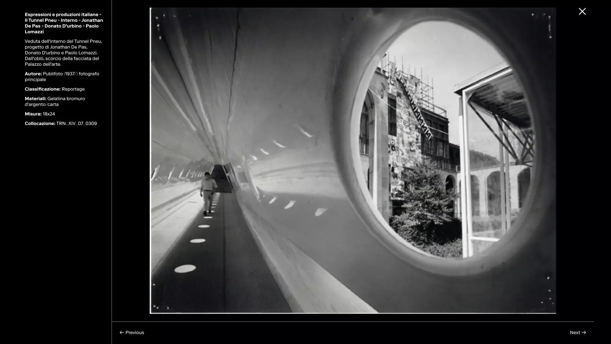
The website' archive is a comprehensive resource for artifacts—photographs, videos, ephemera—related to triannual exhibitions dating back to 1936. Additionally, it houses each object in the permanent collection. Searchability is customized to suit user needs, bearing in mind that museum staff and researchers are a key audience. Archives are navigable by a sliding–scale timeline, with filters for exhibition edition and designers.

Circulation tools are strategically placed to keep users onsite and engaged, and to subtly link the museum's rich history with present and future activities. This functionality extends to the physical museum as well—in the near future, displays will be installed on–site, allowing visitors to enrich their in–person experience with without interrupting it.