Work People About Contact

Mapping the UK's Thriving Startup Scene

2016 — 2023 | Sifted | Technology Media

The UK is home to a thriving startup scene with borders that extend far and wide beyond London. With the support of Microsoft, digital tech publication Sifted contacted Accurat to build an interactive editorial experience that could serve as a comprehensive and centralized resource for entrepreneurs, tech workers, and investors to discover the richness of opportunities outside the capital city.

Challenge

Distill a wealth of geo-specific data for presentation on a sleek, interactive & editorial interface.

Solution

An inventive approach to visualization, designed for productive engagement.

Services

UX, UI, and data visualization design; Front–end development

Deliverables

Web interactive; Website

Background & Process

Backed by the Financial Times, Sifted is Europe's leading media platform for founders, tech workers, and investors. The outlet purports to take a people–first perspective and "sift" through the industry's newswires to deliver breaking news, thought–provoking commentary, and actionable reports.

The idea for UK Startup Explorer was born in the context of a partnership with Microsoft for Startups: the tech giant's suite of solutions and support services for entrepreneurs. Editors contacted Accurat to create an interactive, map–based microsite spanning 21 regions in England, Scotland, Wales and Northern Ireland.

We worked as an agile unit with Sifted's team, holding weekly syncs for core team members and biweekly meetings for a larger group of stakeholders. As a result, the end–to–end production process—from the research stage through design, prototyping, and implementation activities—occured in just eight weeks.
Outcome

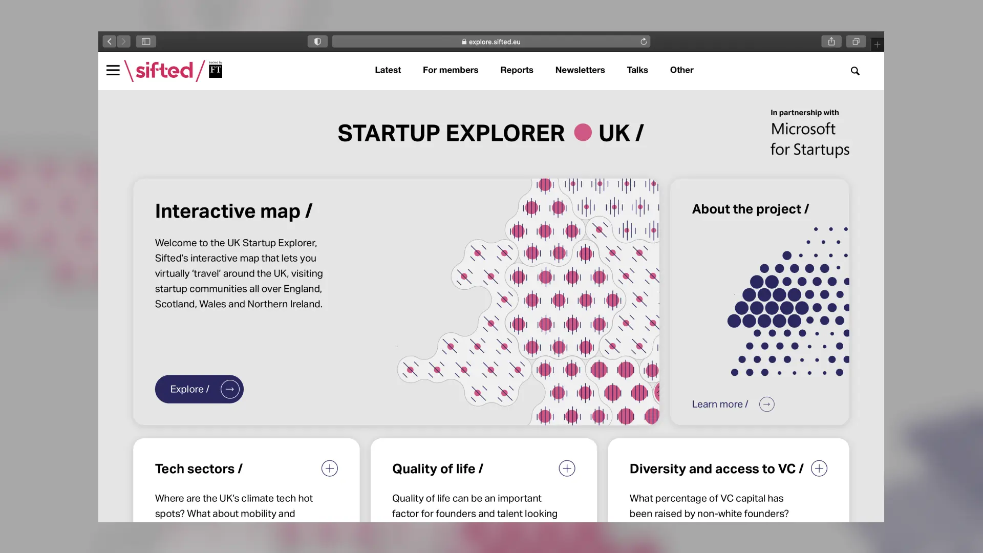
The UK Startup Explorer launched in the summer of 2021 with a dedicated link–out on Sifted's homepage. Users are greeted by a landing page that provides an introduction and quick explainer on the Explorer. Information is presented in a series of expandable cards, each of which contains its own dataviz.

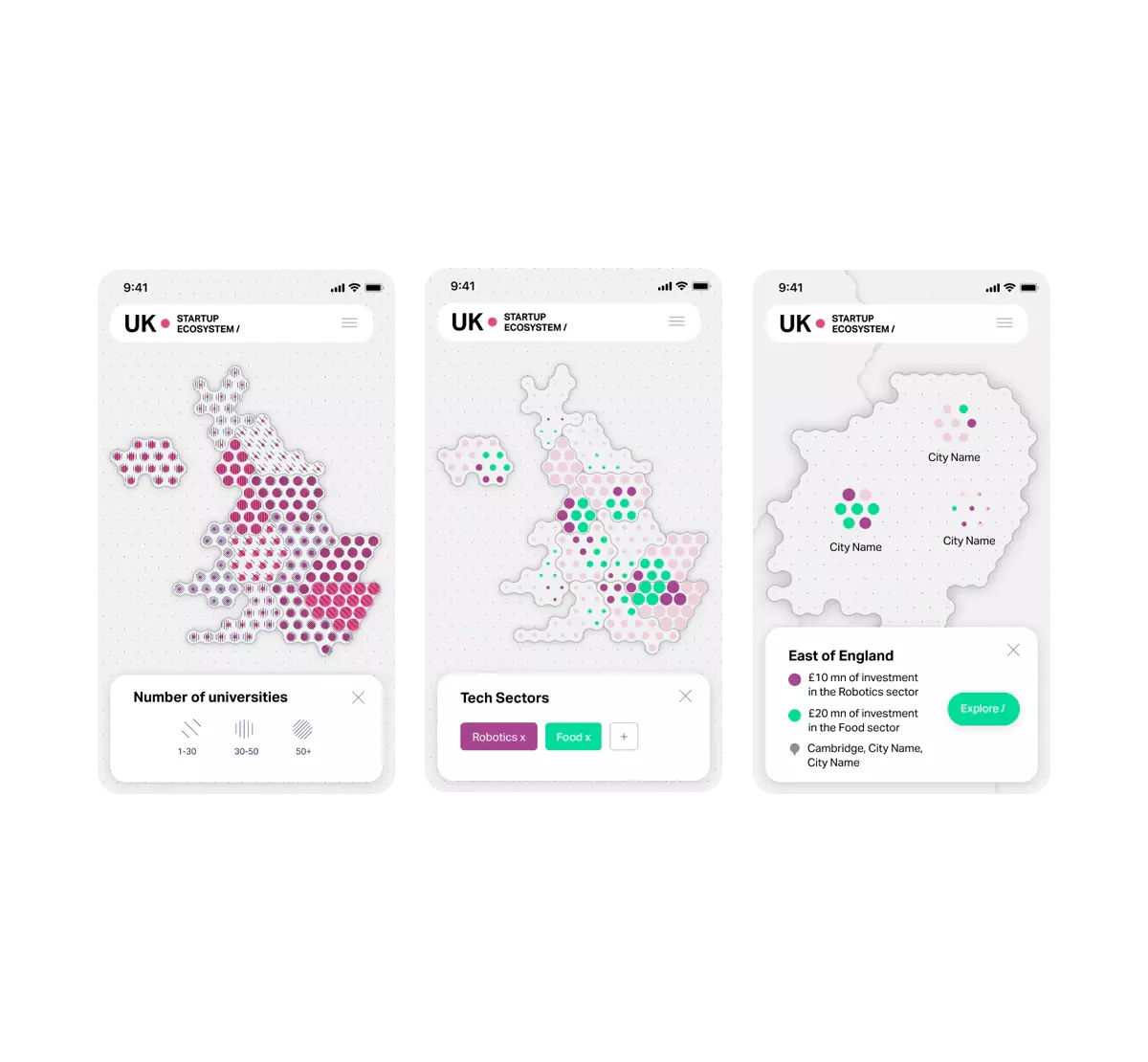
The volume and granularity of data, paired with the site's intended level of high interactivity necessitated that we explore solutions to keep information highly organized. We put our knowledge of UX/UI best practices to use and took advantage of color–coding and a range of textures and patterns to distinguish visual units. The finalized design abstracts information for readability without sacrificing clarity.

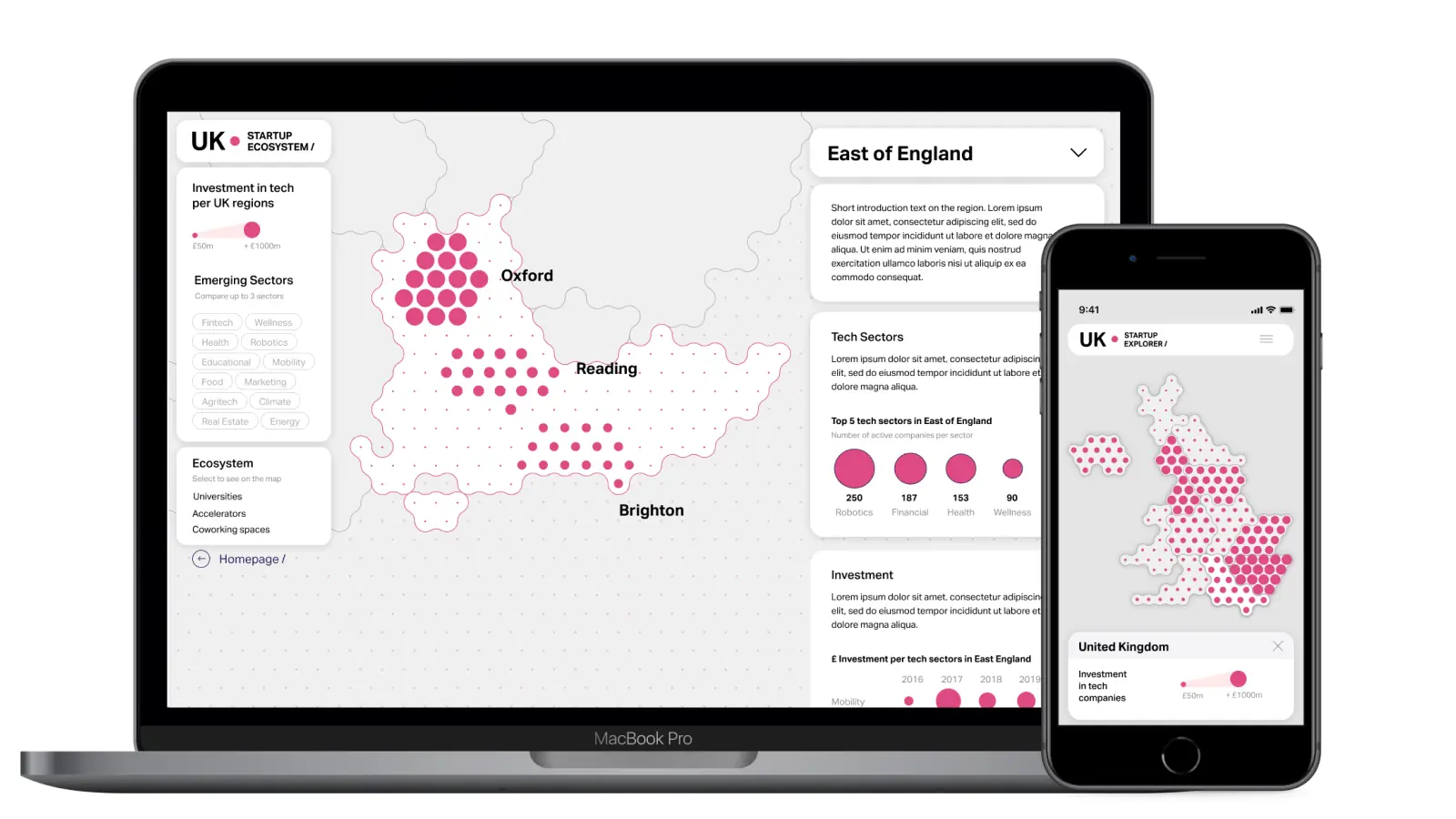
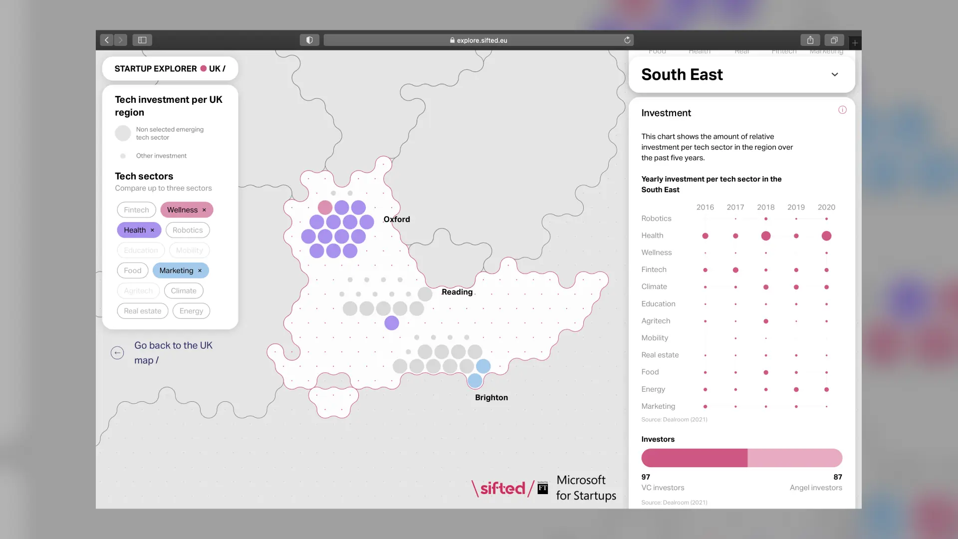
On the map interface, each region is composed of dots, the size of which corresponds to the value of regional investment in tech companies in 2020. Users can click on specific areas to access more information, such as the "startup ecosystem," or the concentration of supportive facilities such as universities, accelators, and co-working spaces.

Apropos of the brand's editorial mission, the map–based, user–friendly microsite serves up information relevant to multiple facets of entrepreneurship. In addition to data on venture capital, investment, and sector interests, the tool provides answers to questions related to culture and well–being. From a bird's eye vantage point down to a regional scale, users can investigate questions such as: What percentage of VC capital has been raised by non-white founders? What does the investment gender gap look like? How do offices affect the quality of life in surrounding areas?

UK Startup Explorer is the first output of what's intended to be a longterm partnership with Sifted. Since its release, we have continued to work a dedicated team as part of an overall redesign of the brand's digital identity.