Work People About Contact

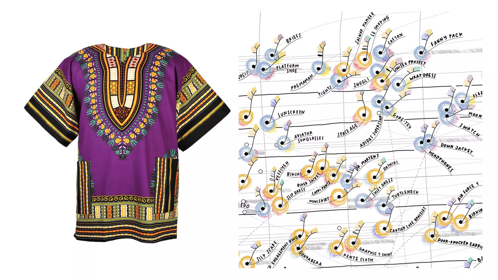
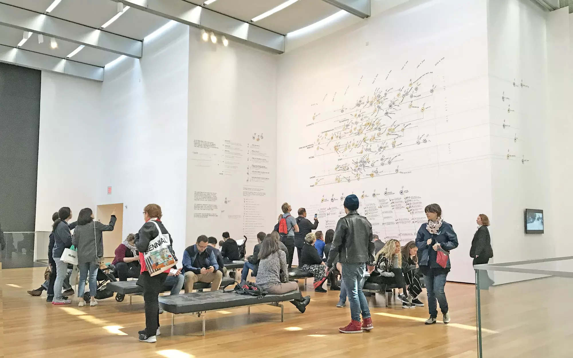
Extracting Data from Fashion Trends

2017 Museum of Modern Art | Art Museums

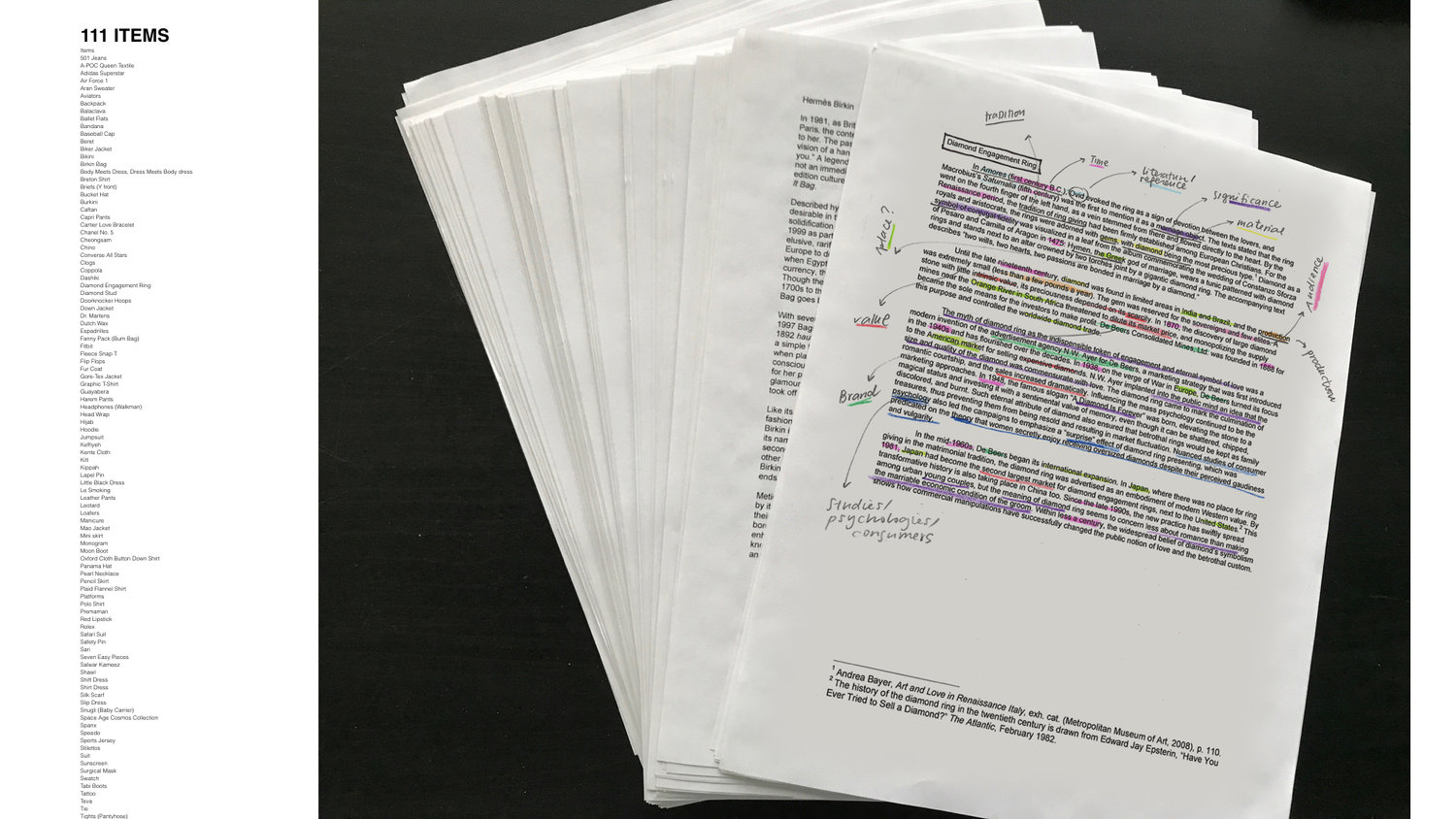
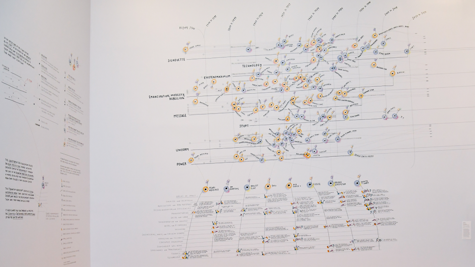
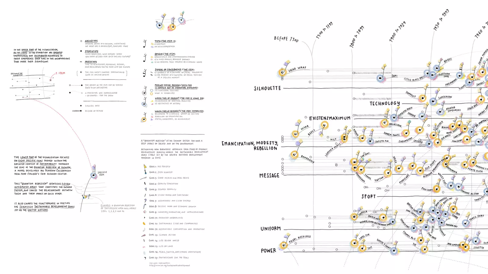
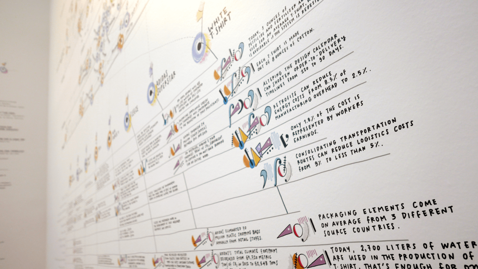
The Museum of Modern Art's blockbuster 2017 show Items: Is Fashion Modern? took an analytical look at 111 modern objects of apparel from around the globe. The Department of Architecture & Design commissioned Accurat to design a large–scale, encompassing data installation for the exhibition's exit area.

Challenge

Transform qualitative information into material for an evocative display. 

Solution

A large-scale data installation that imparts key themes with a hand-drawn aesthetic. 

Services

Data visualization design

Deliverables

Data art installation

Background & Process

Using exhibition research as a starting point, we began our work with a deep–dive survey to familiarize ourselves with both the objects in Items as well as the vision of curators. We discerned some key themes: each piece seemed representative of the ways in which fashion can signal camaraderie with a given culture; each signified the ways in which sartorial choices can influence the ways that people live their lives. From these conclusions, we came up with a set of charged questions that could yield yes/no, either/or answers. For example:

  • Was it selected for innovative design or production features, or because it made an artistic statement?

  • Did it spark social change, or was it the product of a specific moment in cultural history?

  • Was it worn to conform or rebel?

  • Why was it considered modern?

The final step was to visualize the findings of our investigation in a mural: a format worlds apart from the spreadsheets that data is usually associated with.

Outcome

Data Items: A Fashion Landscape dominates three 20–foot walls on MoMA’s sixth floor. It comprises two grids hand–drawn by Accurat co–founder Giorgia Lupi. Both position the exhibition's 111 items according to thorough systems of classification born from our research.

In the first layer—the Landscape—we provided an overview of each Item and the exhibition. Objects are situated on the grid according to the time period of their emergence (the Y–axis) and their section in the exhibition (X–axis). Each data point is further demarcated according to characteristics such as whether it's a garment or accessory, or, at the other end of the subjectivity spectrum, what type of message it sends. For example: the color of shading at a data point's base symbolizes a) belonging to a group or culture b) rebellion or emancipation or c) status, uniqueness, or achievement.

The second layer, situated under the first, homes in on the commercial lifecycle of eight Capstone objects, using the “Quantum Redesign of Fashion” framework developed by Glasgow Caledonian New York College’s Fair Fashion Center. This model identifies 15 areas for intervention in the fashion industry and ties them to Sustainable Development Goals (SDG) set forth by the United Nations in 2015. Our dataviz uses original symbology to denote each of the SDGs, and places them according to where they'll have the biggest impact in disrupting current systems.

With Data Items: A Fashion Landscape, we aimed to provide an alternative way of looking at the exhibition's 111 objects. While the Items spanned time periods and continents, our mural showed how they could be thought of as part of a complex—yet unified—ecosystem: a step towards alignment in tackling the global issue of sustainability. Positioned near the exit of the exhibition, Data Items also served to leave visitors with an impression that reinforced the mission of the show: that object–oriented analysis could be done meaningfully, and with respect to the idiosyncratic nature of each piece.