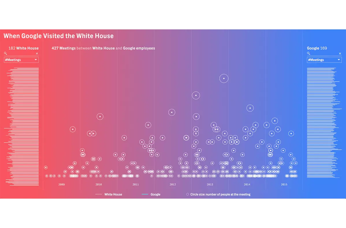
When The Intercept—an award-winning publication with a proggresive slant—conducted a deep–dive investigation into communications between the White House and Google, they uncovered a staggering volume of meetings between the two organizations, plus a revolving door of personnel. Editors realized the need for a strong showcase for their data–driven reporting to make its (un)ethical implications clear—and accessible.
We created two interactive visuals from the Intercept's data, both of which invite users to a web experience to connect the dots (literally) between key figures at the White House and Google and draw their own conclusions. The first graphic illustrates the volume of meetings between Obama administration officials and Google representatives.
